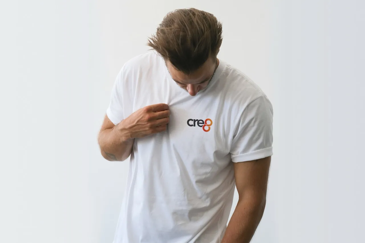
CRE8 is Every Child Online’s creative repurposing club, turning parts from donated or end-of-life tech into unique accessories and upcycled items that raise funds for the charity. It’s a hands-on, circular-economy initiative: devices that can’t be refurbished are harvested for components and transformed into sellable creations to support digital-inclusion work.

The brief was to launch CRE8 with a complete, recognisable brand that could live confidently on small physical products and across community outreach. We were asked to create the visual identity (logo, colour, typography and icon direction) and a clear set of brand guidelines so volunteers and partners could apply the brand consistently on product cards, posters and social updates. The core goals: communicate “creative reuse,” feel proudly connected to Every Child Online, and help the initiative raise awareness and funds by making CRE8’s purpose instantly understandable at a glance.
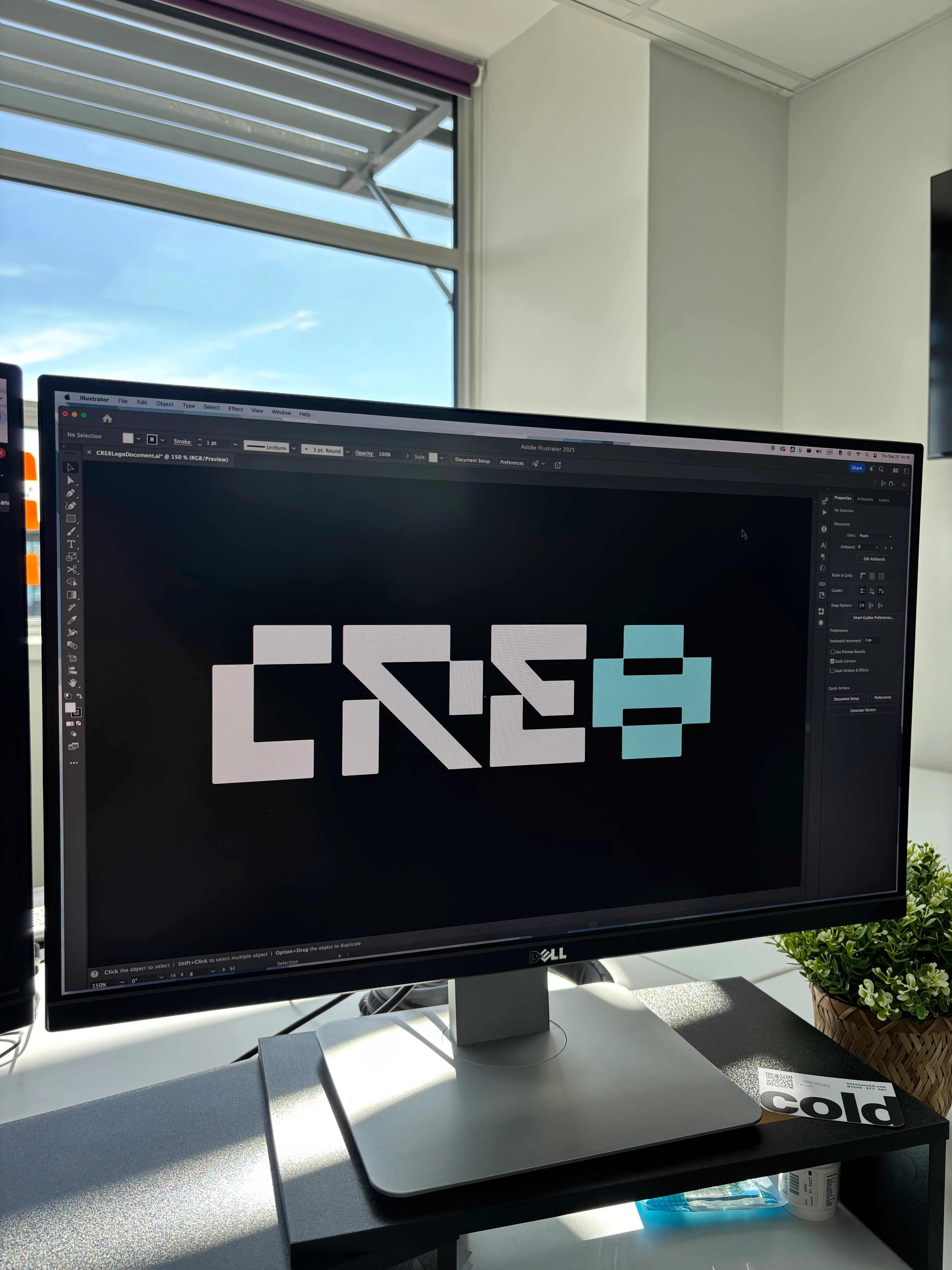
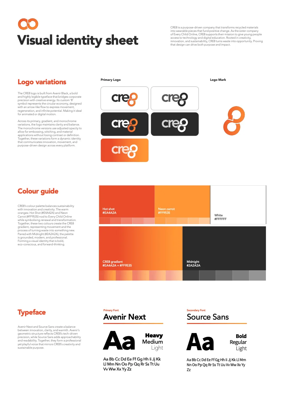
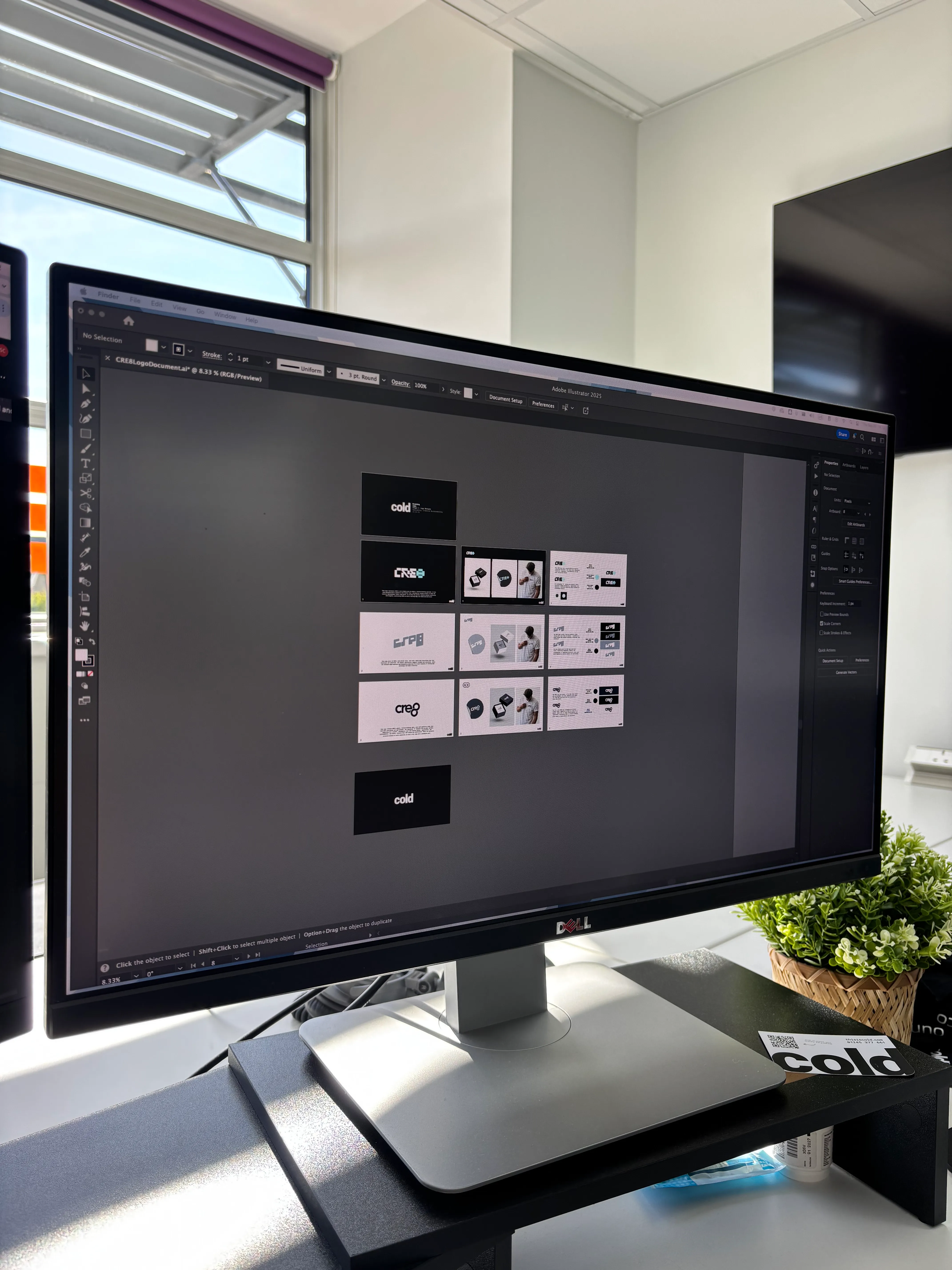
We built a bold, maker-friendly identity system for CRE8: a modular logo mark, confident word-mark, and a vibrant palette paired with legible, characterful typography.
The guidelines cover logo usage, clear-space and lockups, micro-brand applications for small labels, and layout recipes that scale from tiny product tags to A3 posters and social tiles—so the look stays consistent whether an item is sold at a stall or promoted online.
The result is a brand the team can proudly stamp on every upcycled piece—amplifying the story of reuse, funding, and digital inclusion behind each creation.
made by


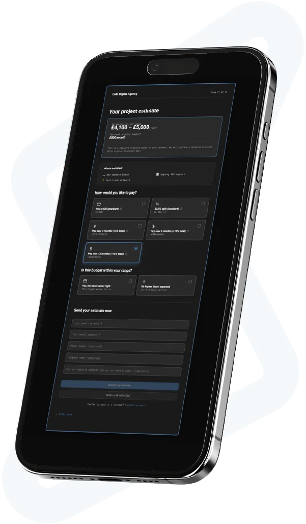
This is an instant, live ballpark quote, not a final proposal. It can cover branding, websites and marketing. You will see a project range and flexible payment options, including pay-over-time. Takes about 3 minutes.
Optionally, enter your email so we can save your estimate:
Prefer to skip the calculator and ask a quick question? Drop us a line and we'll be in touch.