SanDisk - A Lesson in Modern Branding

SanDisk's rebrand landed where Jaguar's stumbled: clear vision, respect for legacy, broad appeal. The breakdown and the lessons.
Written by
Max builds most of what you see on our sites, then makes sure Google can read it. He works in loops: build, test, pull it apart, build it better. His best fixes arrive out of nowhere, usually with the headphones on and something loud playing. Ask him which DJ set changed his life and clear your afternoon.
Read bio ↓How SanDisk's rebrand sets a standard, unlike some
Rebranding is a delicate balance of honouring a brand's legacy while backing a vision for the future. In December 2024, SanDisk unveiled its new identity: a minimalist design and a philosophy centred on a "Mindset of Motion". In stark contrast, Jaguar's rebrand, released around the same time, drew criticism for abandoning its heritage and taking a divisive creative approach.
What did SanDisk do differently, and why did it succeed where others stumbled? Here are the elements of the rebrand and the lessons for businesses working with a branding agency.
The essence of SanDisk's rebrand
SanDisk's rebrand celebrates its roots in innovation while positioning the company for the future of data storage. With its spin-off from Western Digital planned for 2025, the new identity communicates independence and progress.
Key highlights of the rebrand
- Sleek new logo
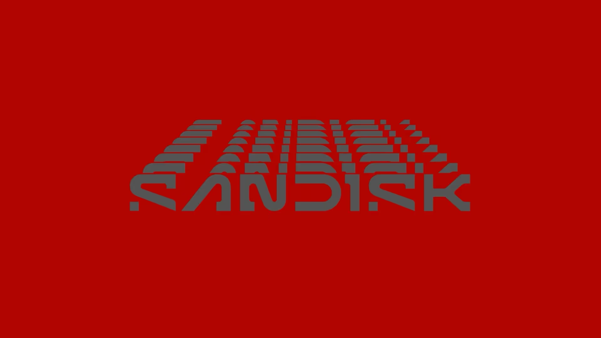
The new logo has clean lines and a minimalist design. The open "D" and pixelated "S" symbolise collaboration and the digital age, and land well with a tech-savvy audience. - Mindset of Motion
This philosophy reflects SanDisk's commitment to progress, and fits its role as a leader in flash memory and storage. - Unified aesthetic
SanDisk embraced minimalism in a way that works for individual and business customers alike.
Why SanDisk's rebrand works
Unlike rebrands that alienate their audience, SanDisk's strategy is rooted in clarity, consistency and purpose. Why it landed:
- A clear vision
SanDisk tied its visual identity to its core values of speed and efficiency. Businesses seeking branding services can learn from how joined-up it is. - Respect for legacy
The new identity feels modern but doesn't discard the brand's heritage as a leader in storage technology. - Broad appeal
The design is sleek enough for tech professionals and approachable for everyone else, a balance branding agencies chase constantly.
A contrast with Jaguar's rebrand
Around the same time, Jaguar attempted its own transformation with a campaign built on futuristic aesthetics and cultural statements. Bold, and it drew backlash for several reasons:
- Disconnection from heritage: replacing the growler emblem alienated long-time fans.
- Abstract messaging: no cars in the promotional material created confusion about the brand's focus.
- Polarising elements: cultural statements overshadowed the product, and audiences split.
SanDisk avoided these traps by keeping a clear line to its roots and its product. For companies in Essex or anywhere else, the reminder is that a rebrand should sharpen a brand's identity, not bury it. We covered the Jaguar side of this in full.
Lessons for businesses and branding agencies
Startup or established brand mid-refresh, here's what SanDisk's success teaches:
- Know your audience
Understanding who you serve keeps the rebrand believable. A branding agency in Essex would shape the work around local businesses while keeping it current. - Align aesthetics with values
Visuals should reflect the principles behind them, the way SanDisk's minimalism conveys speed. - Stay authentic
Change doesn't mean binning everything. Keep the elements your audience already trusts, as SanDisk balanced legacy and modernity.
What SanDisk got right
SanDisk's rebrand proves a thoughtful strategy rooted in authenticity can win attention and loyalty at once. Set against the split response to Jaguar's effort, it shows what aligning design with purpose looks like in practice.
If you're weighing one up, this is where an agency like Cold earns its fee: making sure the new identity says the right thing to the people who already trust you.
Written by
Maximillian Giddens
Max builds most of what you see on our sites, then makes sure Google can read it. He works in loops: build, test, pull it apart, build it better. His best fixes arrive out of nowhere, usually with the headphones on and something loud playing. Ask him which DJ set changed his life and clear your afternoon.
.webp)