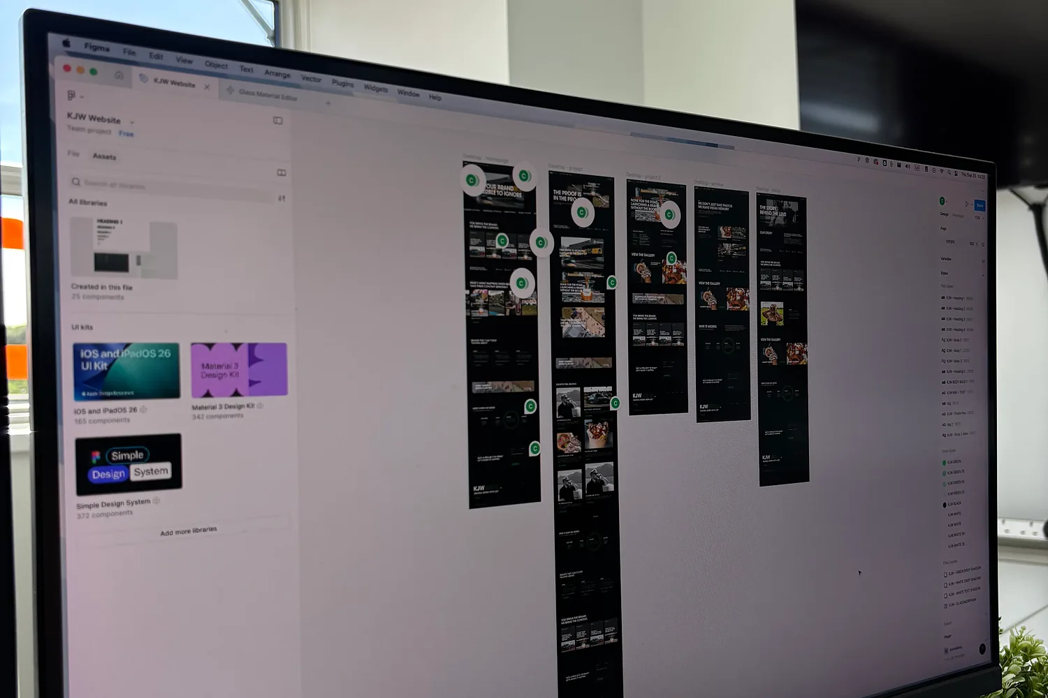
Cold designs interfaces for things with some complexity in them. Portals, booking systems, member areas, dashboards, configurators, and websites where the structure is the hard part rather than the styling. The work splits into two halves: working out how it should behave, then making it look like something people want to use.
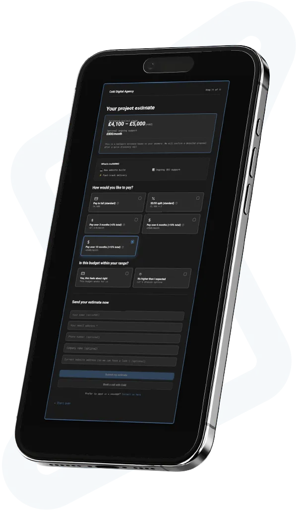
This is an instant, live ballpark quote calculator. You’ll see a project range and flexible payment options, including pay over time and monthly retainer costs.
Step 1 of 2Enter your website (or the one you’d like) to start:









UX work has a habit of producing documents instead of products. Research decks, personas nobody refers to again, journey maps on a wall, and a developer left to interpret the lot. The opposite failure is just as common: straight to a pretty mockup with no thought about what happens when a field is empty, a list has four hundred items, or the user is halfway through and changes their mind. Most interfaces fail at the edges rather than in the demo.
We design the flow before the screens: what someone is trying to do, in what order, and what goes wrong. Then wireframes, then a prototype you can click rather than a picture you have to imagine. Interface design comes after that, built as a system of components rather than a set of individual pages. And the people drawing it are the people building it, so nothing is designed that cannot be made.
Interfaces people get through without being trained. Fewer support calls, because the awkward states were designed rather than discovered. A design system that makes the next ten screens quicker and more consistent than the first ten. And a build that matches the design, which sounds obvious and is rare, because design and development happen in the same room here.
made by








This is where most of the design effort goes. We establish the visual language as a system: type scale, spacing, colour with contrast checked for accessibility, states for every interactive element, and components for everything that repeats. Styling individual screens produces an interface that drifts within six months. A system holds, and it means your developers and ours are working from the same rules rather than from screenshots.
Transactional flows are where good UX earns its money. Checkouts, booking journeys, applications, onboarding, anything with multiple steps and a form at the end. We design for the real conditions: validation that explains itself, progress that is visible, the ability to go back without losing everything, and a clear state for success and failure. Most abandonment happens at a step that was never designed properly.
Interfaces that display content need designing for the content you will have, including too much and none at all. Empty states, long names that wrap, lists with four hundred entries, a dashboard before any data has been collected. We design those cases explicitly, and we design the editing side too, because the person maintaining the content is a user with a job to do.
Design decisions have search consequences and we make them knowingly. Headings used as structure rather than as styling, content in the markup rather than loaded in afterwards, accordions and tabs that do not hide text from crawlers, and a URL structure decided while the flow is still on paper. It is far cheaper to settle this during design than to retro-fit it onto a finished build.
We design mobile first, which is a discipline more than a preference: a flow that works in a narrow column with one thumb is usually a better flow. Touch targets sized properly, forms with the right input types, gestures that do not conflict with the browser, and layouts that reflow rather than shrink. Then we check it on real devices, including the older cheap ones your customers are using.
Redesigning an existing interface starts with what people currently do in it. Analytics, session recordings and a few conversations with the people who use it daily, including your own staff if it is an internal tool. That usually finds workarounds nobody told you about. We keep the patterns people rely on, fix the ones they are fighting, and stage the change so they are not relearning everything in one release.
Week one is flows and research. We work out who uses this, what they are trying to do, where the current version fails them, and sketch the journeys before anybody opens a design tool.
Weeks two to four are wireframes, a clickable prototype and then the interface design, built as a component system. You test the prototype with real users or your own team before a line of production code exists.
From week four the design hands over to build, which is the same team, with the component library and the awkward states documented. We stay involved through build rather than handing over a file and leaving.
Most people judging an interface are not judging the aesthetics, they are judging whether it is going to waste their time. That gets decided in seconds, from whether they can see what to do next. Internal tools have the same test with sharper consequences: if staff find a workaround, they will use it forever and your data will be wrong. The useful thing to know when commissioning this work is that the expensive mistakes happen in the flow rather than the visuals. A beautiful screen in the wrong order costs more to fix than an ordinary screen in the right one.

Forty second answers with no jargon. Anything else, ring the office and ask whoever picks up.
UX is how it works: what someone is trying to do, in what order, and what happens when it goes wrong. UI is how it looks and feels to operate: type, colour, spacing, states, motion. They are separate skills and they fail separately. A good-looking interface with the steps in the wrong order frustrates people, and a well-ordered one that looks unfinished loses their trust before they start.
Two to four weeks for a website, and four to eight for an application or portal with several user types in it. Flows and wireframes take the first week or two, then the interface and the component system. Prototype testing adds a few days and usually saves longer than that in build. Larger products are better done in stages than specified entirely up front.
For a simple marketing site, our experience plus your knowledge of your customers is usually enough. For anything with a complex flow, several user types or an internal audience, skipping research means guessing at the part that is expensive to get wrong. It does not have to be elaborate: a few conversations with real users and a look at what people currently do often changes the design more than a formal study would.
You can price it on our calculator in a few minutes. Design can be bought on its own or as part of a build, and it is priced by the number of distinct screens and flows rather than by pages. An application with several user types and a design system costs more than a marketing site because there is more to decide. You get a written scope either way.
Yes. You get the working design files, a documented component library with states and spacing rules, and the awkward cases specified rather than left for someone to guess at. We would rather talk to your developers during design than hand over a file and hope, because the questions they ask usually improve the design. If we are building it too, the same library drives the build.
Yes, and it is built into how we work rather than added as a review at the end. Colour contrast checked against WCAG as the palette is set, focus states designed rather than left to the browser, interactive elements that work from a keyboard, labels on form fields, and structure that makes sense to a screen reader. If you need to meet a specific standard for a public sector contract, tell us at scoping.
Prova Racing needed user accounts, member-built pages and automation, which is interface design rather than page design. Torus is an AI-powered cyber-insurance and risk platform where we did the naming, brand and build, and Debut Academy came with a rebrand, build and CMS collections across multiple campuses.
If the question is whether the interface converts rather than how it looks, UX and CRO covers the testing side, and web development covers the build.
Smart design decisions, great communication, and fast turnarounds, even over the Christmas break. Everything was scoped clearly, delivered on time, and they went above and beyond with extra refinements.
They delivered a professional, high-quality website and continue to provide excellent ongoing SEO support. Communication is clear, results-driven, and they genuinely understand our business objectives.
I couldn’t be happier with the outcome and highly recommend their team. I would absolutely work with them again (and likely sooner than they expect!).
They delivered far beyond what I was expecting, and I’m honestly over the moon with my new website.
The final product met all our expectations and clearly reflected their creativity, attention to detail, and dedication to delivering quality work.
We were most impressed with Cold | Digital Agency's creativity.
We're impressed with their enthusiasm for success.
They brought our identity to life in a way that felt authentic and future-focused.
Our SEO and Google rankings have improved significantly, and we’ve had a big increase in quality leads coming through the website.
They’re extremely attentive, they listened to what I wanted and brought it to life amazingly.
Superb service for my business and such a professional team.
Excellent service and really delivered on the brief I gave them. Designed the logo and my website, very happy with the result and would highly recommend.
Their whole purpose was to listen to me and deliver.
They provided professional and personalized services to suit my needs.
They consistently delivered all items on time and kept me informed throughout the process.
Overall, we were pleased with the service provided.
Cold | Digital Agency couldn't cater to my needs anymore if they tried.
I have been nothing but greatly satisfied with the work he has done for me, everything has been carefully considered and tailored to me!
They had it built much faster than I was expecting with lots of amazing features, couldn't have asked for a better site and I was very surprised at the great price for the quality they provided.
| WEB DESIGN User flows | WEB DESIGN Wireframes | WEB DESIGN Clickable prototypes |
| WEB DESIGN Design systems | WEB DESIGN Component libraries | WEB DESIGN Accessibility |
| WEB DESIGN Portals and dashboards | WEB DESIGN App interfaces | WEB DESIGN Usability testing |
This is an instant, live ballpark quote, not a final proposal. It can cover branding, websites and marketing. You will see a project range and flexible payment options, including pay-over-time. Takes about 3 minutes.
Prefer to skip the calculator and ask a quick question? Drop us a line and we'll be in touch.